Creating the Perfect Palette for Your Interior Paint
Color is an incredible tool in creating spaces that bring people together, provide comfort and relaxation and offer a backdrop for your life. Sometimes finding the right interior paint colors for your space can be overwhelming - the whites, grays and beiges all start looking the same! This is where an interior designer can help.
And we have just that - an interior designer on staff! Our interior designer will get to know you and your tastes and can help provide direction or suggestions for your palette. In addition to their expertise, we have a couple of our favorite colors that can get your creative side working!
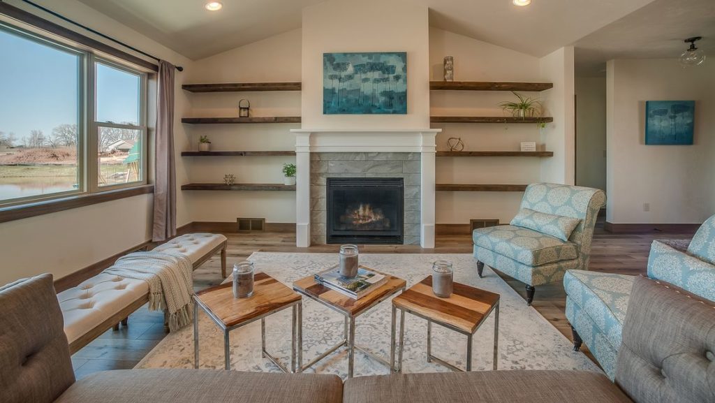
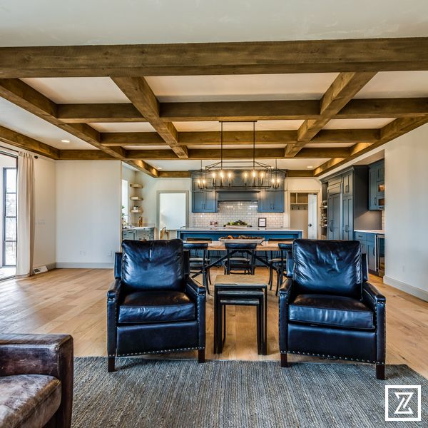
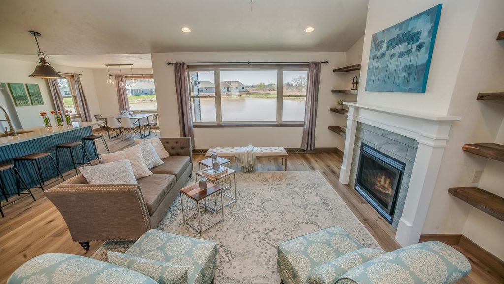
Our go-to neutral white is Sherwin Williams Alabaster and displayed in the pictures above. This sophisticated and endlessly versatile white is far from sterile – it provides a soft, creamy color to any room.
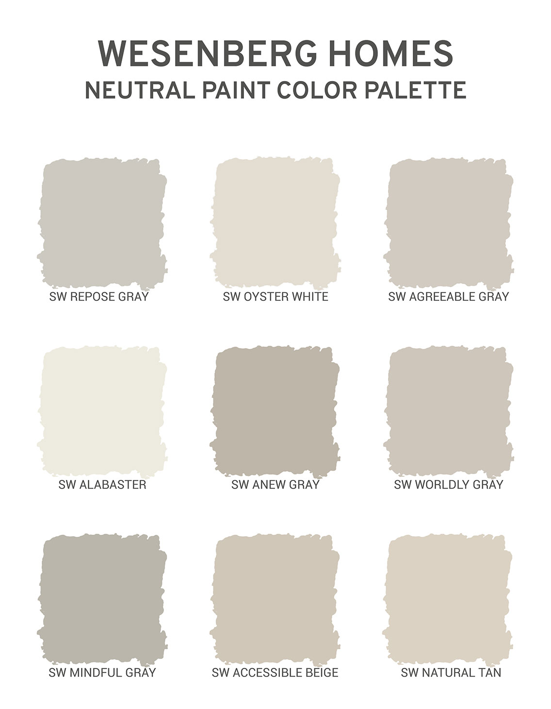
This palette of neutral paint colors in the above picture are our favorites here at Wesenberg Homes.
Each color offers versatility and the ability to mix and match and carry a color palette throughout your home.
Gray is particularly versatile because of its wide range of undertones. A warm gray or greige (a combination of gray and beige) paint color is highly versatile and can be used interchangeably with most other colors. Cool grays, with more blue, are the right choice when beige is too pink or yellow for your space.
If you are looking for the softest, lightest gray that’s not too cool and not too warm, we suggest Sherwin Williams Repose Gray. It’s a great way to remain in the neutral palette while still brightening up a room.
If even “softer” grays are where it’s at for your home, Sherwin Williams Worldly Gray or Sherwin Williams Agreeable Gray each offer gray with a taupe or beige undertone.
Tan and beige are making a huge comeback! Reminiscent of sunny, sandy beaches, these are great colors to use for neutral palettes.
If you’re seeking that perfect light and bright tan without that yellow or pink undertone then Sherwin Williams Natural Tan is your best bet - it lives up to its name “natural tan”. Take it a shade darker, adding a creamier and warm tone by using Sherwin Williams Accessible Beige.
When looking into universally designing spaces, we often target these timeless colors. It allows furniture, artwork, cabinetry, and even the view out the window to pop all while moving forward with you into the future - no outdated colors here!
Do we only use our neutral palette? Of course not! Depending on the homeowner and design style, our interior design team goes through options that create the very canvas that the rest of the home is cast upon. Our goal with color is to enhance your space and allow your personality and design preferences to come through and shine.
For more information on interior paint color palettes and paint offerings, visit Sherwin Williams.


